
When Noor opened the first box of prototype packaging for her small candle label she sat on the
floor and watched the light change across the tins. The color on the label made her think of
evening walks and warm kitchens. She imagined a customer holding that tin and smiling. She
imagined the candle turning into a small ritual. That feeling mattered more than any technical
spec. It was the reason she shelved a design that looked clever but felt cold.
Color is like that. It is the mood of a room before anyone says a word. It is what your customer
feels in a glance. In 2025 color choices are no longer optional decoration. They are a core part
of modern website design and brand transformation. Color signals trust and purpose. Color
guides emotion and choice. If you want online growth you must learn how to design with color
that supports your story.
Why color matters for brand perception
Before a person reads a headline or studies a product photo they register color. Science shows
that color influences attention, memory, and emotion. But beyond the science the human truth is
simple. Color carries meaning and meaning shapes decisions.
A few ways color affects brand perception
Color attracts attention and creates focus on the page
Color creates emotional context for the message you want to deliver
Color influences perceived value and trustworthiness
Color organizes information and reduces cognitive load
When your color palette is intentional you do more than decorate. You design for clarity. You
design for feeling. And those feelings lead to action.
Focus keywords used naturally: modern website design, brand transformation, digital branding
2025, online growth
The basics of color psychology every designer should know
Color responses vary across cultures and individuals but certain associations are common
enough to be useful.
Warm colors make things feel energetic
Reds and oranges convey urgency, appetite, and warmth. They can increase heart rate and
draw attention.
Cool colors create calm and trust
Blues and greens are often associated with stability, health, and nature. They are useful for
financial services and healthcare where trust matters.
Neutrals give space to the message
Greys, creams, and off whites help other colors breathe and let content hold focus without
competition.
Saturation and brightness change meaning
A vivid saturated color feels modern and bold. A muted tone feels refined and timeless.
Contrast guides action
High contrast on call to action elements makes them obvious. Low contrast backgrounds allow
content to be more contemplative.
These principles are tools not rules. Use them to form hypotheses and then test with real users.
Practical examples that illustrate the power of color
Example one Boutique coffee brand
A boutique coffee label wanted to feel both artisanal and modern. We used a warm brown as
the primary color to evoke roasted beans and paired it with a muted teal for freshness and
contrast. On the website the teal guided links and micro interactions while brown framed product
images. The result was a clearer identity and a noticeable uplift in trust signals. Customers
wrote that the site felt like a friendly neighborhood roastery not a faceless shop.
Example two Telehealth provider
A telehealth startup wanted to appear professional and caring. We favored soft blues and a
gentle green for confirmations. Urgent alerts used a warm red sparingly. The palette reduced
anxiety in the booking flow and improved appointment completion rates. The color choices
helped the brand feel competent and human at once.
Example three Creator brand on social
A solo creator selling digital templates chose a bold magenta as a signature color to stand out in
crowded feeds. That color became an instant recognition cue. When followers scrolled the feed
they paused on posts with the magenta accent. The color created a visual habit that increased
click through to the website.
Each example shows how color clarifies identity and builds trust across touch points.
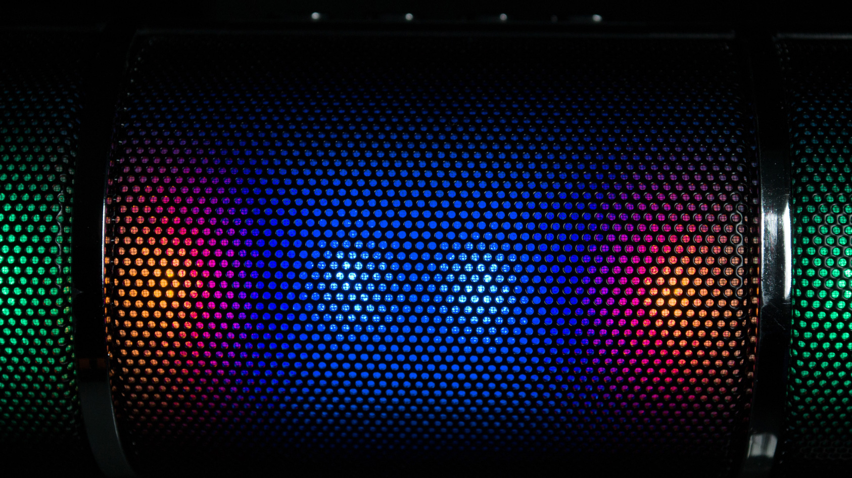
Colors don’t just decorate — they communicate. The right palette can shape perception, trigger emotion, and turn brands into experiences people remember.
Conclusion
Conclusion and call to action
When Noor watched light move across those prototypes she was imagining the story a
customer would tell. Color made that story possible. In 2025 color psychology is a first class tool
for designers and brand builders. It affects trust, clarity, and the feeling your brand leaves
behind.
If you want to transform your modern website design and create a color system that supports
brand transformation and digital branding 2025 start by asking one question What feeling do I
want my customer to remember If you can answer that clearly you can choose color that makes
that feeling obvious.
If you would like help testing palettes or building a color system that supports online growth I
can work with you to map choices to measurable outcomes. Let us design color that does more
than look good. Let us design color that changes how people feel and how they choose.